working on inpaper.co.in

Hey everyone! Welcome back to the channel! Today, I’m taking you on a full behind-the-scenes journey of how we built this website — from sketch to screen. So buckle up, because it wasn’t just about code and design — it was a full creative rollercoaster!
📌 Day 1: The Idea Phase
It all started with an idea — scribbled on paper, late at night. We didn’t want to make “just another website.” We wanted something that felt alive, personal, and fully us. We listed out everything we wanted: clean visuals, fast load times, mobile-friendly design, and most importantly — a vibe that matches our creative energy. From there, we jumped into brainstorming layouts, color palettes, fonts, and even the mood we wanted people to feel when they landed on our page.
📐 Day 2-3: The Design Sprint
Then came the design sprint. We started sketching wireframes, both on paper and digitally using Figma. We tested different layouts, aligned sections, tried out gradient backgrounds, explored scroll effects, and even experimented with interactive elements like floating buttons, animated sections, and a unique product showcase. This was when the website really started coming to life in our minds.
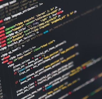
💻 Day 4-7: The Development Grind
Now for the fun part — building! We coded the site using HTML, CSS, and JavaScript for smooth interactions. We embedded a few 3D elements using tools like Spline to add a modern touch, and we made sure the site was responsive so it looked stunning on phones, tablets, and desktops. Every section — from the hero banner to the product store — was carefully crafted to not only look good but feel intuitive to use.
🔗 Day 8: Hosting & Backend
We hosted the site on Hostinger — super easy setup, reliable performance. We connected forms using Google Forms initially, but later switched to more customizable alternatives for image submissions and product orders. We also added SEO tools, optimized images, and installed analytics to track user behavior.
🎨 Day 9-10: Refining & Polishing
This part was all about perfection. We fine-tuned the UI, added smooth transitions, optimized the loading speed, and tested across browsers and devices. Every little animation, hover effect, and interaction was reviewed again and again — until it felt just right. We also wrote all the content from scratch — making sure our tone felt authentic and aligned with our brand.
🚀 Day 11: Launch Day!
After countless tweaks and coffee-fueled late nights, we finally hit the launch button. The feeling was surreal! Seeing our vision live online and being explored by real users — that’s when it all felt worth it.
📈 Post Launch: Growth Mode ON
Since launch, we’ve been continuously evolving the site. Adding features like a blog, image upload for users, more product options, and user feedback forms. We're also integrating social proof and starting content marketing to bring in more organic traffic.
💬 Final Thoughts
This website isn’t just a project — it’s our digital home, our portfolio, our store, and our story all rolled into one. Every corner of it has a little piece of our heart. And we’re so excited to keep building, growing, and sharing it with the world.
Thanks for coming along this journey. If you're working on your own site — just remember: it doesn’t have to be perfect from day one. Just start. Build. Learn. Grow.
See you in the next vlog! 👋✨